
As part of my bachelor thesis at the Berlin University of Applied Sciences and Technology (Berliner Hochschule für Technik), I designed the app "disciplina". The thesis explored the impact of internet addiction on daily life, highlighting the ethical responsibility of companies and UX designers. I proposed that UX design can mitigate the issue related to digital addiction by creating products that respect users time and needs, allowing the internet to enrich our lives in a responsible matter.
Internet Addiction
At the start of my thesis, I conducted research on internet addiction. I began by reviewing the literature on both substance and behavioral addictions, followed by a focus on internet addiction, which was first identified as a disturbance in 1995. I examined the diagnostic criteria, defining internet addiction as the compulsive overuse of digital products to the detriment of the user. This can involve various activities like online gaming, gambling, shopping, and social media use.
I found that the documented prevalence of internet addiction varies across studies, with 2% to 10% of people identified as addicts, and many more displaying symptoms. Teenagers and young adults are particularly affected. The implications of internet addiction are extensive, impacting both health and social life. These include concentration difficulties, ADHD, cognitive decline, impulsivity, mood swings, anxiety, depression, poor sleep, increased risk of diabetes and obesity, strained relationships, and reduced social skills.
I identified three main risk factors contributing to internet addiction:
Social environment characteristics, including the anonymity provided by the internet
Personal traits, such as high neuroticism and low conscientiousness
The characteristics of the internet itself, such as its ubiquity, the low mobile internet costs, and the prevalence of addictive, free apps driven by attention-economy models and AI algorithms.
Impact of Technology
I then researched how tech companies exploit user psychology to boost engagement and maximize profits. They use various techniques, such as:
Push notifications: These are strategically used to draw users back to apps, often interrupting their focus and lowering their overall concentration.
Social manipulation: Leveraging our natural desire for social connection, companies use features like likes, comments, endorsements, and activity streaks to trigger dopamine release, keeping users engaged.
FOMO (Fear of Missing Out): Companies tap into users' anxiety about missing important digital content or events.
Infinite streams: Users are presented with endless content feeds that automatically display videos, photos, and other media, making it difficult to stop scrolling. Advertisements are seamlessly integrated, and the frictionless design traps users in a continuous loop of consumption.
Ethical Responsibility
I then examined the ethical implications of addictive digital products, arguing that product and UX designers have a responsibility to create apps that enrich lives without draining users' energy, time, or money. I emphasized the importance of Human-Centered Design and the need for designers to consistently prioritize user well-being, despite the pressures of daily work.
I also explored the conflict between developing humane products and the financial goals of companies, which often prioritize profits over ethical considerations. I defended the creation of user-friendly apps, noting that making addictive products for monetary gain can backfire, as frustrated users may eventually abandon the app. Furthermore, as market trends shift, the new generation increasingly values ethics, transparency, sustainability, and responsibility. Concepts like digital minimalism and digital detox are gaining popularity, reflecting a growing awareness of healthier internet use. Companies that fail to adapt to these changes risk falling behind.
Existing Solutions
I analyzed the measures companies have implemented to help users reduce screen time. Some of these are built into operating systems, such as screen time analysis tools and system-level limits on app categories, though these limits can be easily bypassed. There are also focus modes that allow users to control which apps are accessible at different times of the day, and options to make the screen grayscale to reduce the allure of bright colors like red or yellow.
Social media apps have also introduced features like usage overviews and time limits, though these are often somewhat hidden. Additionally, I examined third-party apps designed specifically to reduce screen time. Many of these apps offer screen time overviews similar to system-level tools, but some go further by displaying prompts before opening social media apps, encouraging users to reconsider their actions.
Moreover, there are mobile phones designed with reduced capabilities, offering only essential functions like contacts, simple messaging, a camera, and a map. This more radical approach ensures that users spend minimal time online.
Developing a New Concept
Based on these observations, I began thinking about a new approach to mitigating the effects of internet addiction. I realized that many built-in limitations provided by companies are minimal efforts, often insufficient for those struggling with addiction. True change requires strong inner motivation, so the solution must be something users genuinely want to engage with.
I aimed to design an app that would help users gradually reduce their online time, avoiding the abruptness of a "cold turkey" approach, which can lead to relapse. My concept was to create an app that offers the same incentives as addictive platforms but with firm, unskippable limits.
After brainstorming, gathering inspiration, and comparing existing solutions, I defined four core principles for the app.
Appealing Content with Hard Limits: Instead of completely denying users the content they enjoy, my app would offer carefully curated, interesting content based on the user's preferences, but with strict daily limits that cannot be bypassed.
Ethical Approach: The app would have no annoying pop-ups, no data collection, no cookies, no notifications, and no login requirements, ensuring a respectful and non-intrusive user experience.
Intentional Friction: Unlike addictive apps that strive for a seamless experience, my app would introduce intentional friction to slow down the experience, helping users break old habits and engage more mindfully.
No Social Aspect: To avoid the trap of social manipulation, my app would exclude communication features, encouraging face-to-face interactions or the use of dedicated messaging apps, rather than blending social features into an addictive environment.

To demonstrate this concept, I created an interactive prototype of a mobile application. Although I developed it as an iOS application for demonstration purposes, none of the core principles are tied to the operating system. The design should, in theory, be easily transferable to other platforms like Android with minimal adjustments.
Name
Before designing the application's interface, I considered various names for the project. Most options were derived from Greek and Latin words, as these languages form the basis of many Western languages, making the name recognizable to people from different nations. I ultimately chose "disciplina", the Latin word for discipline, which embodies the concepts of self-control, development, education, willpower, and learning. These key ideas are central to the app's purpose and reflect the commitment to self-improvement and its associated values.
Logo and App Icon
Next, I designed a logo for the project, which also serves as the app icon in the prototype. I began by sketching various visual ideas on paper, inspired by the nature of the app and the meaning of the word "Disciplina." These initial sketches included symbols of self-improvement and education, such as a staircase and a target. Ultimately, I developed a more abstract design using the first and last letters of the name, symbolizing the journey from the start of self-improvement to becoming more confident and organized.
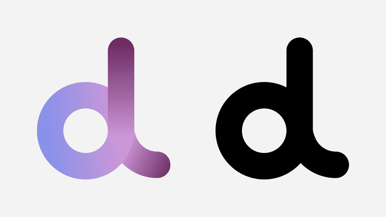
I chose a circular shape for the logo because round shapes are more common in nature and visually appealing. This also aligns well with the overall look of iOS. The colored version of the logo uses cool tones, with shades of blue, pink, and violet, to soften the aggressiveness of warm colors, aiming to reduce feelings of anxiety and stress. The colors blend into each other in a gradient, conveying a sense of transformation and continuous flow. This color scheme is also used throughout the app's user interface.
Low-Fidelity Prototype
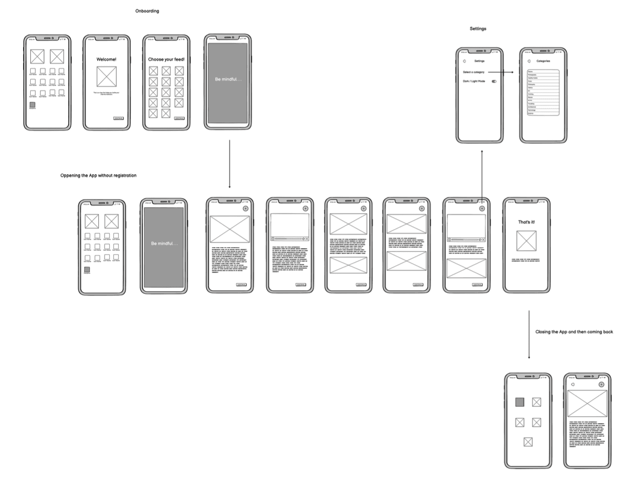
After finalizing the name and logo, the next step was to design the application's interface. I used Balsamiq to create a low-fidelity prototype with black-and-white wireframes, allowing me to structure the screens on a more abstract level. Simple geometric shapes served as placeholders for images, videos, and text content, while the more detailed design was reserved for later stages.
High-Fidelity Prototype
Based on the black-and-white wireframes, I used the UI design tool Figma to develop a more sophisticated high-fidelity prototype.
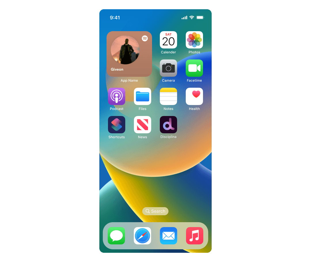
The starting point for the prototype is the iOS launch screen, where the app icon is prominently displayed.
← Previous Next →
Testing the Concept
After completing the prototype, it was time to test it with users. I selected the concept testing method as the most appropriate approach for my case. Concept tests offer users a preview of the final product's core ideas and functionality without focusing too much on the prototype's details. The study was conducted through moderated conversations in order to receive more insightful feedback than through other methods like online surveys as the focus was on qualitative rather than quantitative results. The tests consisted of two parts: a brief interview about the participants experiences with mobile usage, followed by a presentation of the prototype and subsequent user feedback.
Preparing the User Tests
Interview Questions
A list of background questions was selected to be useful for the study. Similar to other user interviews, the survey begins with open-ended questions to explore participants personal experiences with internet use:
How do you use your phone?
Which apps do you use the most?
Have you ever stayed online longer than intended?
Have you ever said to yourself, "Just a few more minutes" while online?
Those were followed closed-ended questions to analyze their preferences or determine if they have observed certain behaviors:
Have you ever tried to spend less time online? If so, how?
How much time do you think you spend on your phone daily?
If you agree, could you share how much time your phone actually shows as screen time or digital well-being?
Prototype Questions
After the brief interview about their phone usage experiences, participants were shown the prototype. They then provided feedback, starting with general questions to allow them to share as many observations as possible. This approach helps identify any points that may not have been considered during the prototype development and study preparation.
What do you think of this concept?
What did you like or dislike about it?
What would you have liked to see or what would you change?
The feedback session concluded with a series of closed-ended questions to gather some quantitative data. For these final questions, I chose the Likert scale method, which typically offers five response options, including a neutral choice. To ensure participants had to choose a side, I provided only four options, eliminating the neutral option.
Question | Strongly disagree | Disagree | Agree | Strongly agree |
|---|---|---|---|---|
11. I think this app can help a person with an addiction to the internet: | ◯ | ◯ | ◯ | ◯ |
12. I can imagine myself using this app: | ◯ | ◯ | ◯ | ◯ |
13. I would recommend this app to a relative of mine if I knew they were spending too much time on their phone: | ◯ | ◯ | ◯ | ◯ |
Conducting the Tests
The criteria for selecting study participants were that they are young individuals who use smartphones and are active on social media. A time slot was scheduled with each participant a few days in advance. I emphasized that participants should have a good internet connection, be in a quiet place, and use a laptop or tablet for the call, keeping their phone free for testing the prototype. Since the Figma prototype was not publicly accessible, a special Figma account with view-only rights was set up. Participants were asked to install the Figma app on their phones (available for iOS and Android) to test the prototype under realistic conditions, rather than on a desktop device which offers different interactions. If someone forgot to install the app, the prototype was temporarily accessible via a link that could be opened in a mobile browser with some restrictions.
The sessions began with gratitude for the participants time and willingness to help, a brief introduction to the study's topic, and a short explanation of how some apps are designed to be addictive. I then explained the structure of the concept test. Participants were informed that their responses would be anonymized, the session would not be recorded, and it was fine if they preferred not to share certain information. Throughout the conversation, I avoided terms like "test" or "interview," which might cause anxiety, and used neutral terms like "research" or "study" instead.
After the introduction, the main part of the test began with the interview questions outlined above. This was followed by the prototype testing. I first clarified that only a prototype, not a complete application, was designed, to avoid confusion if something did not work as expected. Participants were then given the Figma account login details and asked to imagine themselves as heavy phone users looking to change their habits. Before interacting with the screens, they were instructed to think aloud and verbalize everything they saw or clicked, as the tests were conducted remotely and direct observation was not possible. After interacting with the prototype, participants provided their feedback and were given a screenshot of the Likert questions to review before answering. The tests concluded with a final thank you for the participation.
Over the course of four days, a total of eleven tests were conducted. The first test served as a pilot to refine the questionnaire, ensure all necessary materials were available, and assess the timing. On average, each test lasted about 30 minutes.
Evaluation of the Results
The participants, aged 24 to 32 and all daily smartphone users, used their phones for communication, social media, news, music, photography, and navigation. Many reported spending more time online than intended, often saying "just a few more minutes". Overall, they had a good self-assessment of the time they spent online, with values ranging from 20 minutes to six hours per day. Almost everyone had attempted to reduce screen time through various methods like deleting apps ("digital detox") or setting usage limits, some even going further by setting their WiFi router to turn off at midnight.
The feedback on the prototype was generally positive. Participants found the navigation clear and appreciated the lack of intrusive pop-ups. However, some wanted more information about the app’s concept on the initial screens. The "Be Mindful" screen, which appeared briefly, was either seen as a helpful reminder or a negative directive. Users found the content engaging but had mixed feelings about the length—some preferred less text, while others wanted more. The quiz-style content and videos were particularly well-received. Participants had some issues with the required scrolling and button-clicking instead of swiping, but understood the design choice upon explanation.
Overall, while the app was recognized as informative and different from typical time-consuming apps, some users felt it lacked the social aspect of their usual apps. Suggestions for future improvements included bookmarking articles, adding a dark mode, highlighting key content, and sharing posts outside the app. The responses to the closed questions at the end of the questionnaire were also helpful in evaluating the concept more effectively.
11. I think this app can help a person with an addiction to the internet:
Strongly disagree | Disagree | Agree | Strongly agree |
|---|---|---|---|
2 | 5 | 3 | 1 |
Most participants were skeptical about whether the app could truly help someone struggling with internet addiction. Those who disagreed felt that an app alone isn't sufficient to change such behavior; strong internal motivation is needed. There is a risk that users might become bored with the app throughout the day and turn to apps like Instagram for new content. However, with the right motivation and self-discipline, the app could be a useful tool for promoting more mindful phone usage.
12. I can imagine myself using this app:
Strongly disagree | Disagree | Agree | Strongly agree |
|---|---|---|---|
1 | 1 | 3 | 6 |
Most respondents described themselves as curious individuals and found the content and presentation engaging, leading them to envision using the app themselves.
13. I would recommend this app to a relative of mine if I knew they were spending too much time on their phone:
Strongly disagree | Disagree | Agree | Strongly agree |
|---|---|---|---|
2 | 1 | 4 | 4 |
Respondents were inclined to recommend this app to people in their circle as an alternative to time-consuming apps if they know the individuals struggle with excessive screen time. However, one respondent who disagreed noted a general reluctance to recommend apps to others.
Final Thoughts
The study introduced a new mobile app concept aimed at helping users gradually reduce screen time rather than imposing strict limits or deleting apps. The app focuses on mindful content and adds friction to replace constant dopamine triggers with information that can't be consumed for hours.
Concept tests with social media users showed general positivity towards the prototype but also some skepticism about its effectiveness in combating internet addiction. Users acknowledged the need for strong internal motivation to reduce phone use and suggested additional features like bookmarking and sharing options.
To refine the concept, these suggestions should be considered, and the app's daily content limits might be adjusted. Future development should include a long-term study to assess its real-world impact.


